Start with what the room already contains
Before choosing paint or accessories, look at the colors you are unlikely to change soon. Flooring, a sofa, shelving, curtains, and large pieces of furniture all influence how a new color will look. Write down their main colors and undertones in ordinary terms: warm brown, cool gray, creamy white, or muted blue. This gives you a starting point rather than a shopping list.
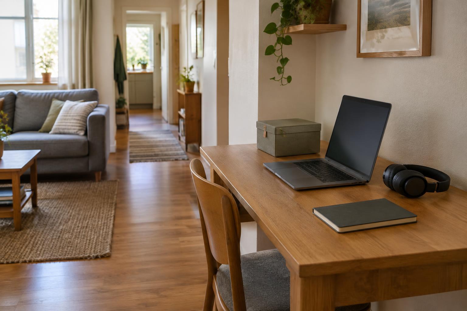
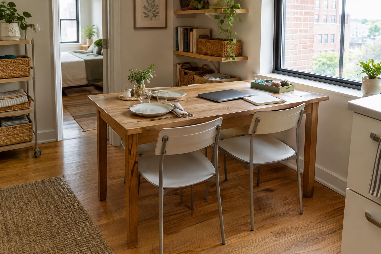
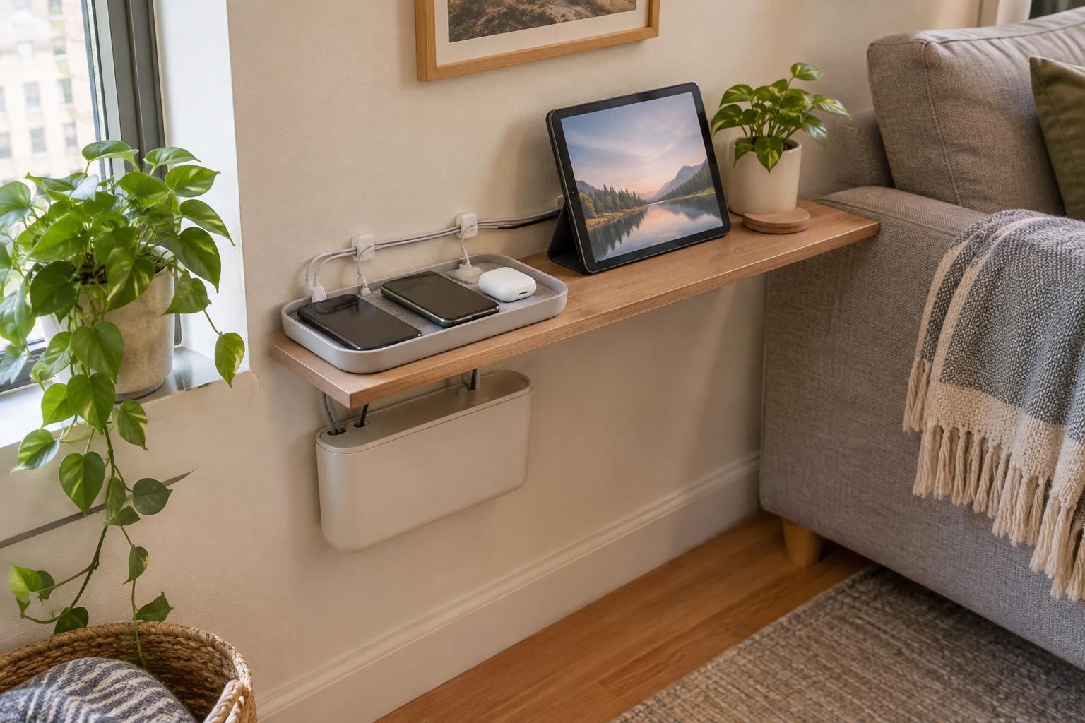
Next, notice how the room is used. A living room might also hold a desk, dining table, and children’s supplies. Decide which items stay visible during the day and which can be put away. Visible equipment and storage count as part of the palette, even if you did not buy them as decoration. If a black monitor and white bookcase are permanent fixtures, a few smaller touches in those colors can make them feel intentional.
Choose a small group of colors with different jobs
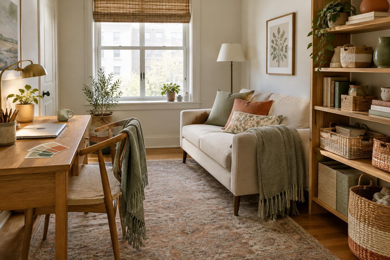
A manageable palette usually has a base color, a supporting color, and an accent. The base covers the largest visible areas, such as walls, a rug, or large upholstery. The supporting color appears on several medium-sized pieces. The accent adds interest in smaller amounts. These are roles, not strict proportions: a compact room may already have enough color in its furniture without needing a painted wall.
For example, a room with a cream sofa and light wood shelves could use warm off-white as its base, soft olive on curtains and seat cushions, and rust on a lamp shade and a few small objects. The colors do not need to match exactly. They should look comfortable together when you see them from the doorway. If the room feels busy, reduce the number of competing accents before buying anything new.
Connect activity areas without making them identical
Color can help distinguish activities while keeping the whole room connected. A work corner might have a deeper shade of the supporting color on a pinboard or desk mat, while the seating area uses a softer version on a throw. A dining spot might repeat the accent in washable placemats. The shared colors link the areas, but each still has its own practical purpose.
Repeat colors at different heights and on different sides of the room. If every olive item sits beside the desk, that corner may feel separate from the rest. An olive cushion across the room or a small piece of art near the table creates a visual connection. You do not need to fill every surface: empty space around a few useful items often makes the palette easier to notice.
Test colors in the room before committing
Light can change how a color appears. A sample that looks calm in a shop may look cooler beside a window or darker near a bookshelf. Bring home paint swatches or small fabric samples and place them beside the flooring, furniture, and any existing textiles. Check them at times when you actually use the room, including when lamps are on.
If you plan to paint, try a sample on a movable board rather than judging a tiny square alone. Place the board in more than one area and look at it from your usual seats. For a lower-commitment test, add the proposed color through a cushion cover, desk accessory, or removable art print first. This helps you decide whether the color works across the room before spending more.
Make changes in an affordable order
Begin by moving and grouping items you already own. Gather objects in your chosen colors, then spread a few of them across the room. Store or relocate pieces that clash and are not needed there. If the result still needs work, start with small purchases such as cushion covers, a tray, or matching storage boxes. Choose items that solve a practical problem as well as adding color.
Leave larger purchases and paint until you know what is missing. A new rug can anchor several activities, but it is a costly way to test a color you are unsure about. Keep a note of the colors you have chosen so future replacements fit the room. A cohesive palette does not require everything to match; it gives the objects used for different activities a quiet connection.